In what follows, the possibilities of the individual graphical representation types of the online analysis are presented. This is intended to simplify the use of the online analysis tools. We can distinguish between two basically different ways of using the online tools: whereas profile comparison provides a quick overview of the strengths and weaknesses within the democratic quality of countries, temporal comparison allows for the analysis of the development of characteristics of democratic quality over time (from 1900).
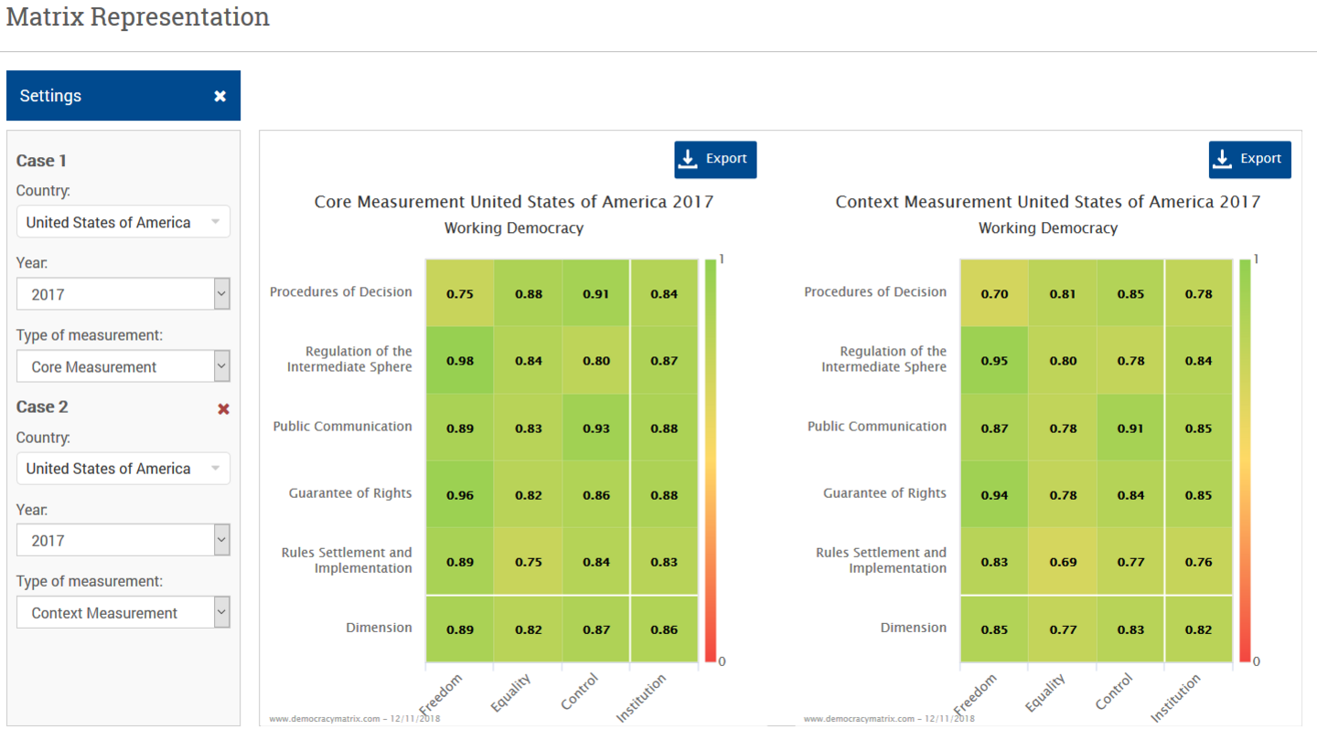
Matrix Representation
Matrix representation is a direct visualisation of the concept of the democracy matrix. The respective values of the democratic quality of a country are displayed for all matrix fields. This form of representation is especially suitable for the visualisation of quality and democracy profiles. The scale (0-1) goes from the bottom to the top, so that high values also mean a high degree of democratic quality. Correspondingly, low values indicate low democratic quality. In addition, the scale values are colour-graded: low democracy values appear in red; the middle range in yellow; and high values are coloured green. Finally, the resulting regime classification for the case in question is also shown in the title.
In order to gain an overall judgment on the quality of democracy of the selected case, not only the values of the individual matrix fields, but also the aggregated values for institutions and dimensions should be taken into account. It is quite possible that a country has a high value for equality in the procedures of due to universal suffrage. But – at the same time – its elections cannot be considered as free due to electoral manipulation or candidate restrictions. This results in a low quality of the procedures of decision as a whole, which is expressed in the aggregated dimensions and institutional values. These values reflect the interplay between the individual matrix fields and thus maintain an integrative perspective on the quality of democracy.
Matrix representation offers different options: You can select different countries, different points in time, and different levels of measurement. You can not only consider one country in isolation, in one year and at one level of measurement, but rather the representation can be expanded to include a second matrix. This allows for the comparison of a case at different points in time or across different measurement levels or also the comparison of two different cases. Start the matrix representation.
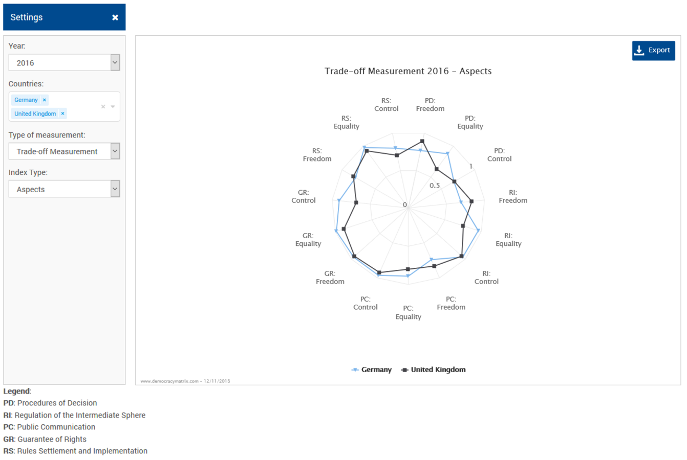
Radar Chart
This type of chart is similar to matrix representation. Democracy quality for the 15 matrix fields, institutions and dimensions is displayed in the form of a spider’s web. In contrast to matrix representation, however, a comparison between several countries is easier to visualise, since the values of the cases are put into relation with each other directly on the same axis. This is especially helpful in connection with the democracy profiles for the purpose of trade-off measurement.
Only one value can be selected respectively for the year, the level of measurement and the set of variables. The set of variables allows for switching between the data for the 15 matrix fields, the five institutions or the three dimensions. Finally, several countries can be selected at the same time to make comparison possible. Open the radar chart.
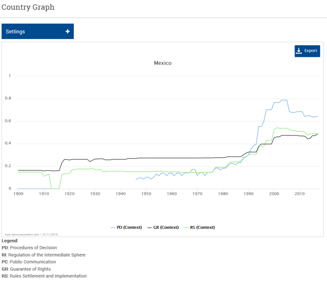
Country Graph
In contrast to the profile comparison representations, time series can be visualised more easily in the country graphs. This allows for the comparison of the development of several aspects within a country over time. Such a comparison shows whether individual characteristics of the democracy matrix have developed to the same extent or differently in a country. To this end, a line chart is used in which the year is displayed on the x-axis and the characteristic level on the y-axis. The characteristics are identified using different colours. It is only possible to choose one country in the settings menu, whereas different variables can be selected. Start analysis using the country graph.
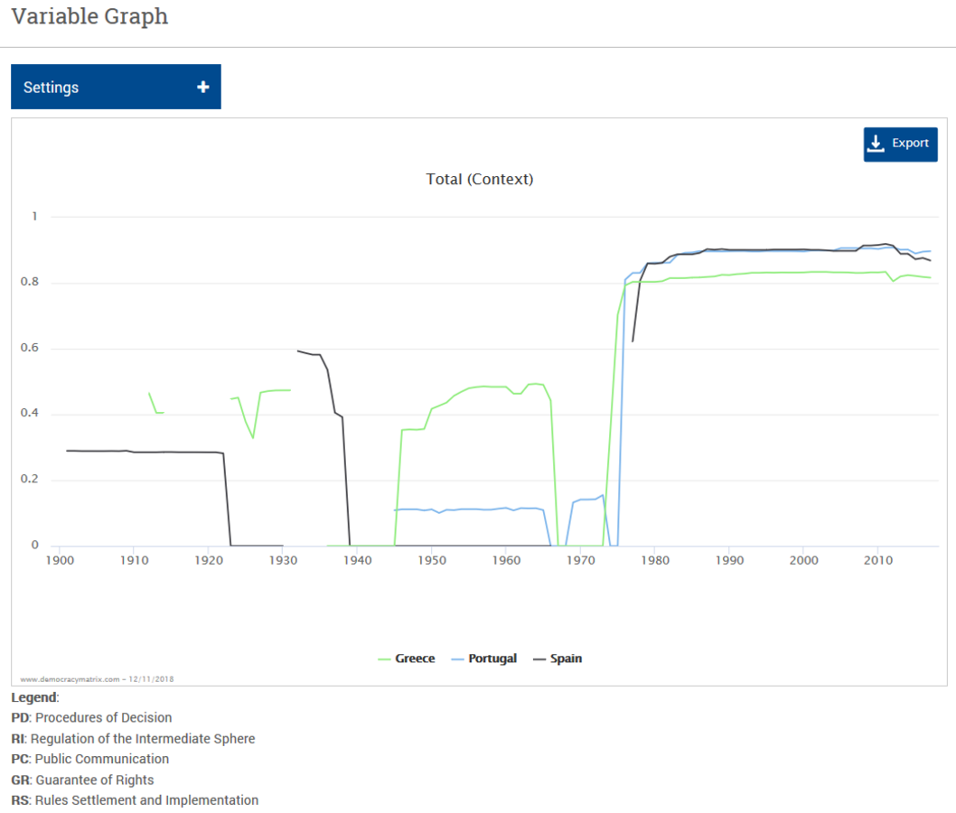
Variable Graph
Like the country graph, the variable graph serves to visualise time series. This is especially useful, since the democracy matrix dataset comprises a period starting from 1900. The variable graph can display the temporal development of an individual variable between several countries. It is a simple line chart, whereby the value of the chosen variable is shown on the y-axis, whereas the year is shown on the x-axis. Countries are marked in different colours. Only one variable of the democracy matrix can be chosen in the settings menu; several countries can be selected, on the other hand. Start conducting research using the variable graph